Slower 999 responses and longer waits in A&E – and it’s not even the winter crisis yet!

Slower 999 responses and longer waits in A&E – and it’s not even the winter crisis yet!

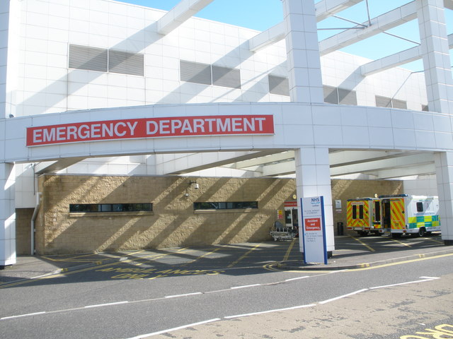
More people are waiting over 4 hours to be seen in A&E than ever before, according to government statistics. Only 84% of people were seen within 4 hours in October 2016, the worst performance ever recorded in October, and 5% worse than last year.

1490886_07ef4a61
12 hour waits in A&E tripled between September October in 2016  Credit: John Ferguson

Not only did A&E have its worse October on record, so did 999.  Only 69% of patients who stopped breathing, or had no pulse, had an ambulance arrive within the recommended 8 minutes. This number fell to 63% when other types of life-threatening calls are included (e.g. severe bleeds, strokes).

To top off a truly disastrous triad for the NHS as it approaches the annual ‘winter crisis’, delayed transfers of care took up more time than ever before. Patients spent over 200,000 days in hospital in October, not because they were ill, but because they couldn’t be moved out of hospital. Delayed transfers (horribly known as ‘bed blocking’) occur for  many reasons, the commonest being unable to find spaces in either care homes or other NHS facilities.

senior-599806_960_720
 Delays in providing mobility equipment can delayed people going home, leaving them at risk to infections and other illnesses  Credit: Matt Sawyers

These three indicators (999 waits, A&E waits and delayed transfers) act as a proxy measure for the slack in the NHS. Good numbers in each mean patients are flowing in and out of hospital in a timely manner. Bad numbers mean the NHS is becoming increasingly bottlenecked, and pressure is building up with the system.

Given that all of these indicators typically worsen over the winter, it seems unlikely we’ll be seeing any improvements in the data in the upcoming months. In all likelihood, we’ll see the most pressurised winter in the NHS since records began. Maintaining quality of care in such an environment will be a Herculean task.


In This Post, I Prove Even Ambulance Performance Data Can Be Interesting

I’m currently on placement in Grimsby, meaning I get to say in the the lovely hospital accomodation. Rave reviews on TripAdvisor leave such glowing reviews as:

‘They’re are no rats’

‘Even on the warmest day in 6 years, the heating was on full blast – such good value!’

‘I appreciate the jail-like feel they’ve gone for. This architectural metaphor really helps show how patients can feel trapped by the system and the illness within which they find themselves.’

In my case, the bleak breezeblock walls have led me to an appreciation of why right wing newspapers feel quite so outraged about everything all the time. Hence me reading an article on Telegraph.co.uk, entitled ‘NHS 111 Investigation: How Ambulances Have Performed Over A Three-Year Period’. After such a succint headline, I was absolutely riveted. How could I not read on after a headline that easily could have been from a first-year undergraduate essay?

All joking aside, I did read on and the article was actually quite informative. The graph the Telegraph gives us shows ambulance data from 2012/13, 13/14, 14/15 and 15/16. When is the cut-off between one year and the next? Who knows! Or are the categories an average of the two years given? Who cares!

At least they tell us the data is from the ambulance trusts in England. Do they link to the raw data themselves? Of course they don’t. I mean, who’d want to read that?

Enough sarcastic bashing of the Telegraph, the data actually paints a rather bleak picture of the state of England’s ambulances.

NB: I’ve ignored data from 15/16 as it is incomplete. Though the picture isn’t much prettier including it.

  • Trusts that answered less life-threatening calls on time in 2014/15 than 12/13: 7  – East, London, North East, North West, South Central, West Midlands, Yorkshire
  • Trusts that were below the ‘75% in 8 minutes or less’ response target in 12/13: 5 – East Midlands, East, North West, South Western, Yorkshire
  • Trusts below target last year: 7 – East Midlands, East , London, North East, North West, South Central, Yorkshire
  • Worst trend in peformance: London – response rates have dropped from 3rd place with 77.7% ‘missed’ responses to propping up the table with 67.2%, a drop of 10.5%
  • Best trend in performance: South Western – increased by 2.2% from 73.0% to 75.2%, the only trust to move from below target to above target
  • Trusts that have never net the 75% target: 2 – East Midlands and East of England.

In other words, the average ambulance trust in England is worse perfiorming than it was in 2012/13, and the average ambulance trust does not answer life-threatening calls as quickly as it should do. There are a few exceptions –  East Midlands, Isle of Wight and South Western have all improved, though East Midlands is still below target.

Overall, one can hardly call the last three years of the Coalition’s health policy a resounding success when it comes to ambulances. Maybe the drivers are nicer, suspensions smoother and everything is a whole lot more ‘efficient’ (read as ‘cheaper and underfunded’), but I think I’d trade them all in for moving ill-people quickly to hospitals. You know, the whole point of the ambulance service.